Tracheotomy
Logo design for a local deathcore band.
My Role: Product Designer
Project Type: Commission
Timeline: 4 days
Tools: Procreate
The Band
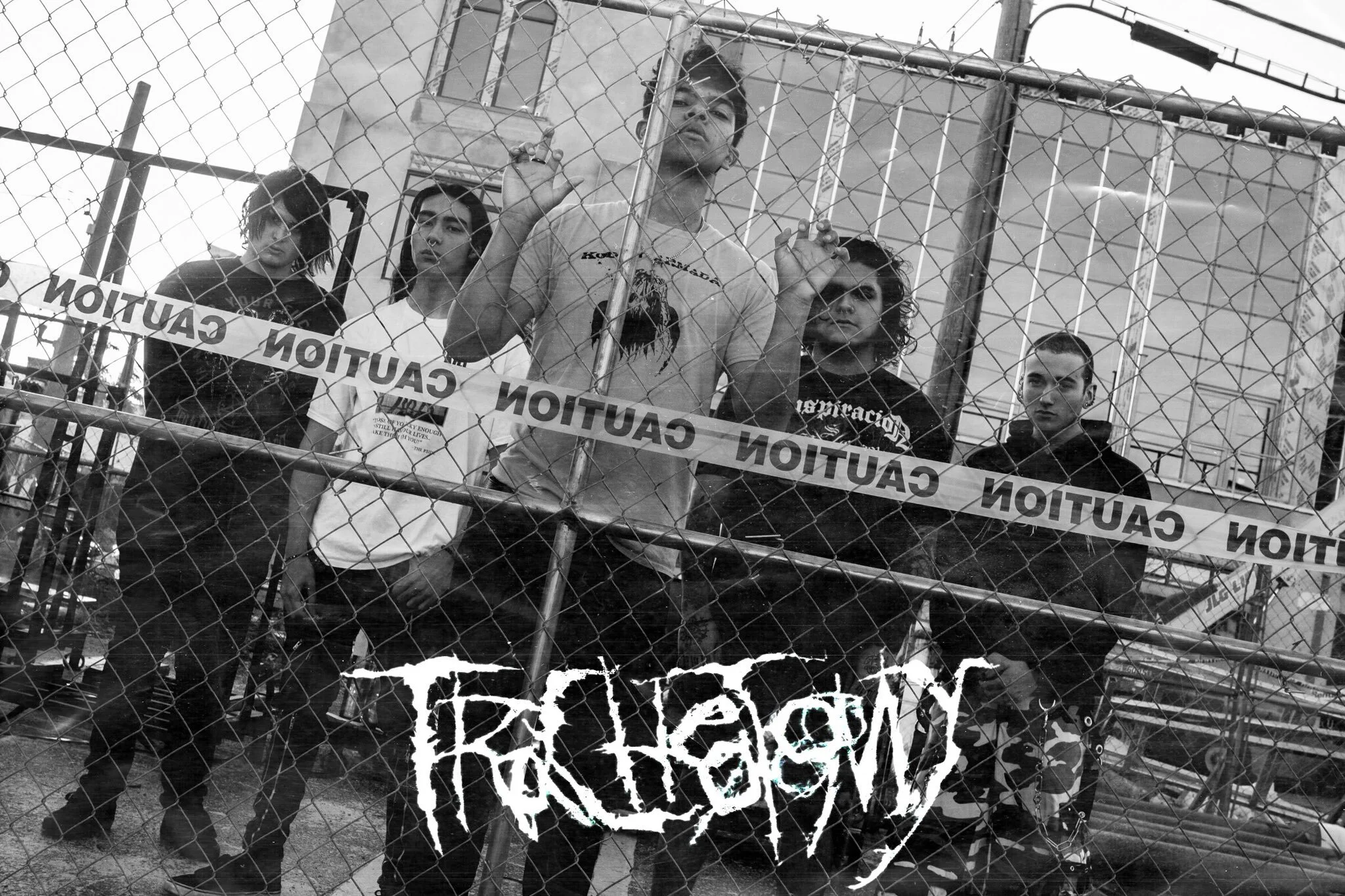
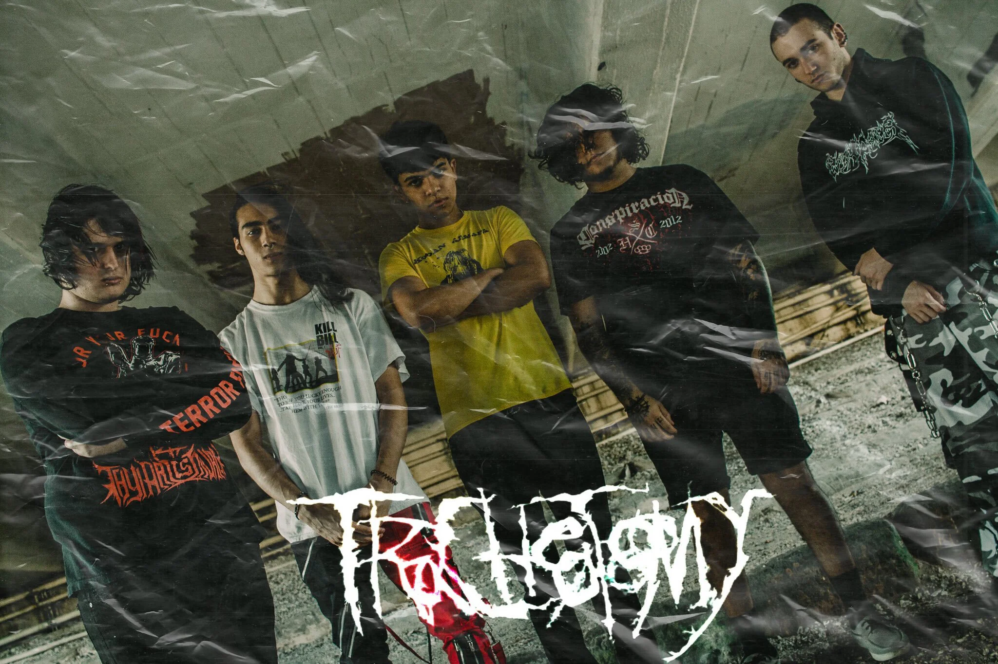
Tracheotomy is a South Floridian band set on bringing back early and mid 2000’s deathcore style of music. Their influences include 2009 Oceano, Necrophagist, and Suicide Silence.
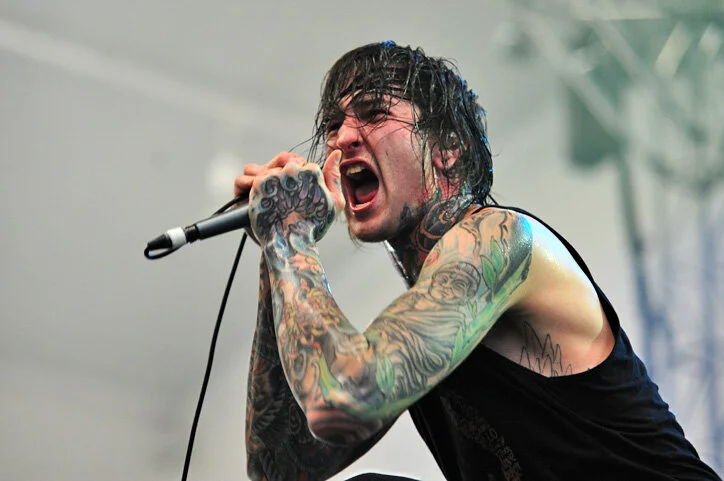
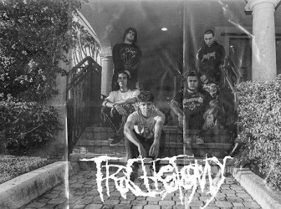
I met the vocalist, Simon (middle), at a New Year’s Party, where we started chatting about music and art. He told me about a band he had formed in November of 2020 and asked if I’d be interested in designing their logo.
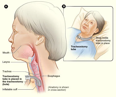
tra·che·ot·o·my
/ˌtrākēˈädəmē/noun medicine
an incision in the windpipe made to relieve an obstruction to breathing.
The name of the band itself told me a lot about the branding— it was dark, sharp, and edgy. Still, I had some more research to do before I could get into designing.
What is “deathcore”?
Deathcore is a subgenre of metal, a type of rock music. It incorporates instrumental elements from other subgenres such as metalcore and death metal.
Inspiration
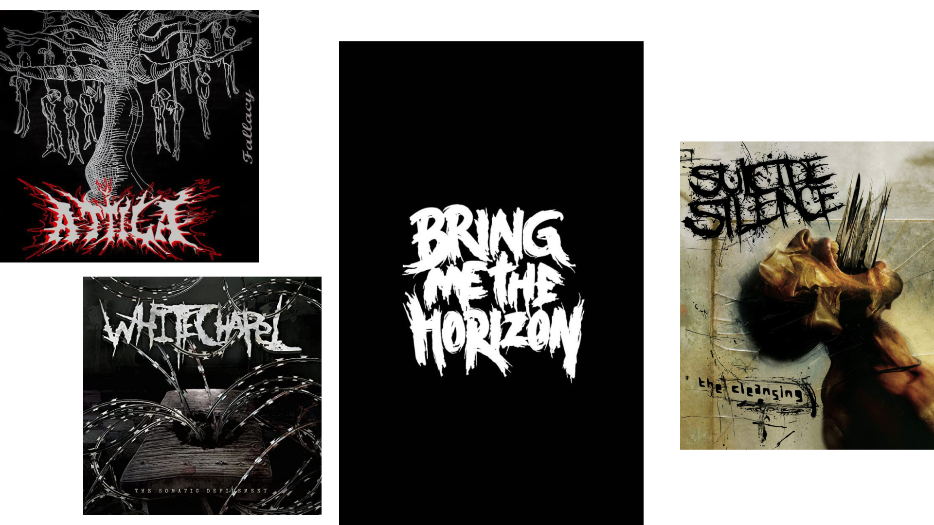
After delving into the world of heavy rock logos, I found some common themes. The wordmark usually consisted of scratchy, capitalized letters in white, black, or red.
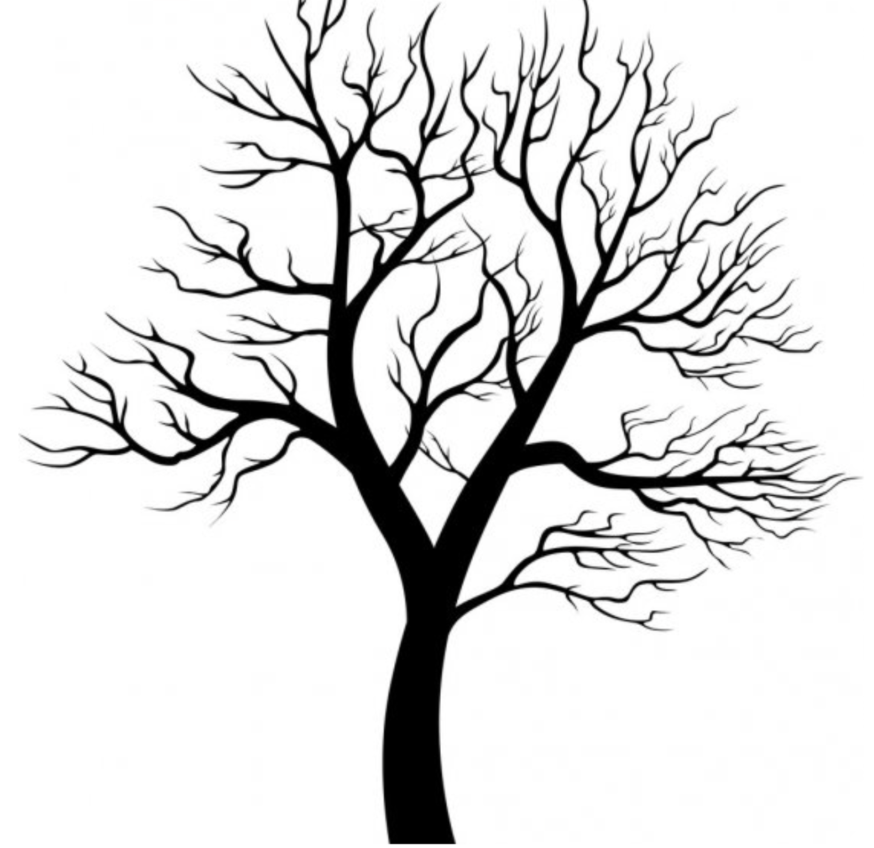
It reminded me of those spooky, leafless trees seen in Halloween movies and illustrated horror books.
Design
Once I was able to spell Tracheotomy, I started the “skeleton” by writing out the word thinly.
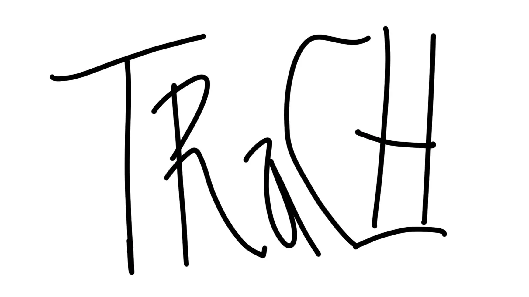
When that was laid out, I began fleshing out the letters.
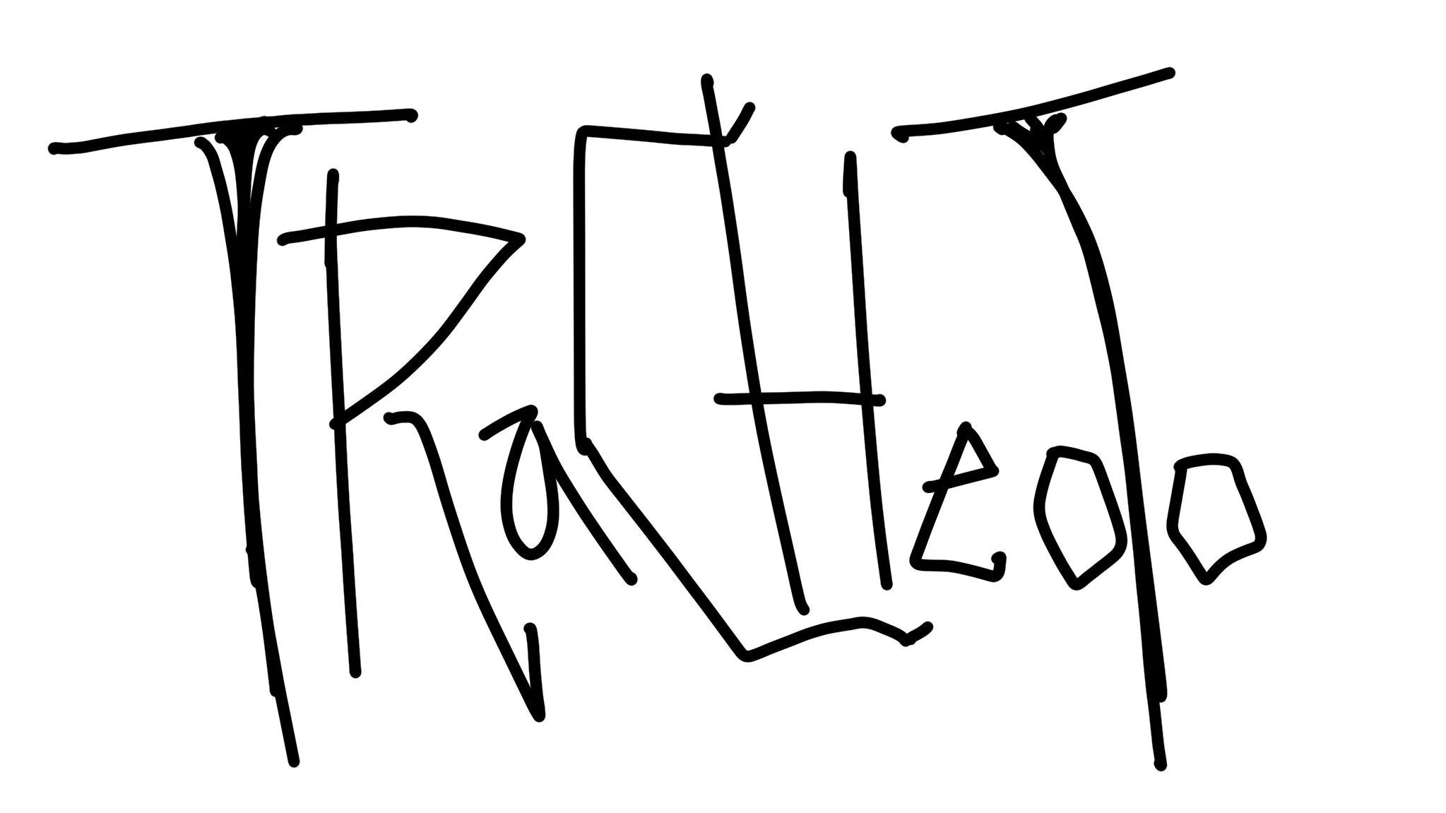
My favorite part was adding the branch-like spikes on each letter. It really brought personality and darkness to the design.
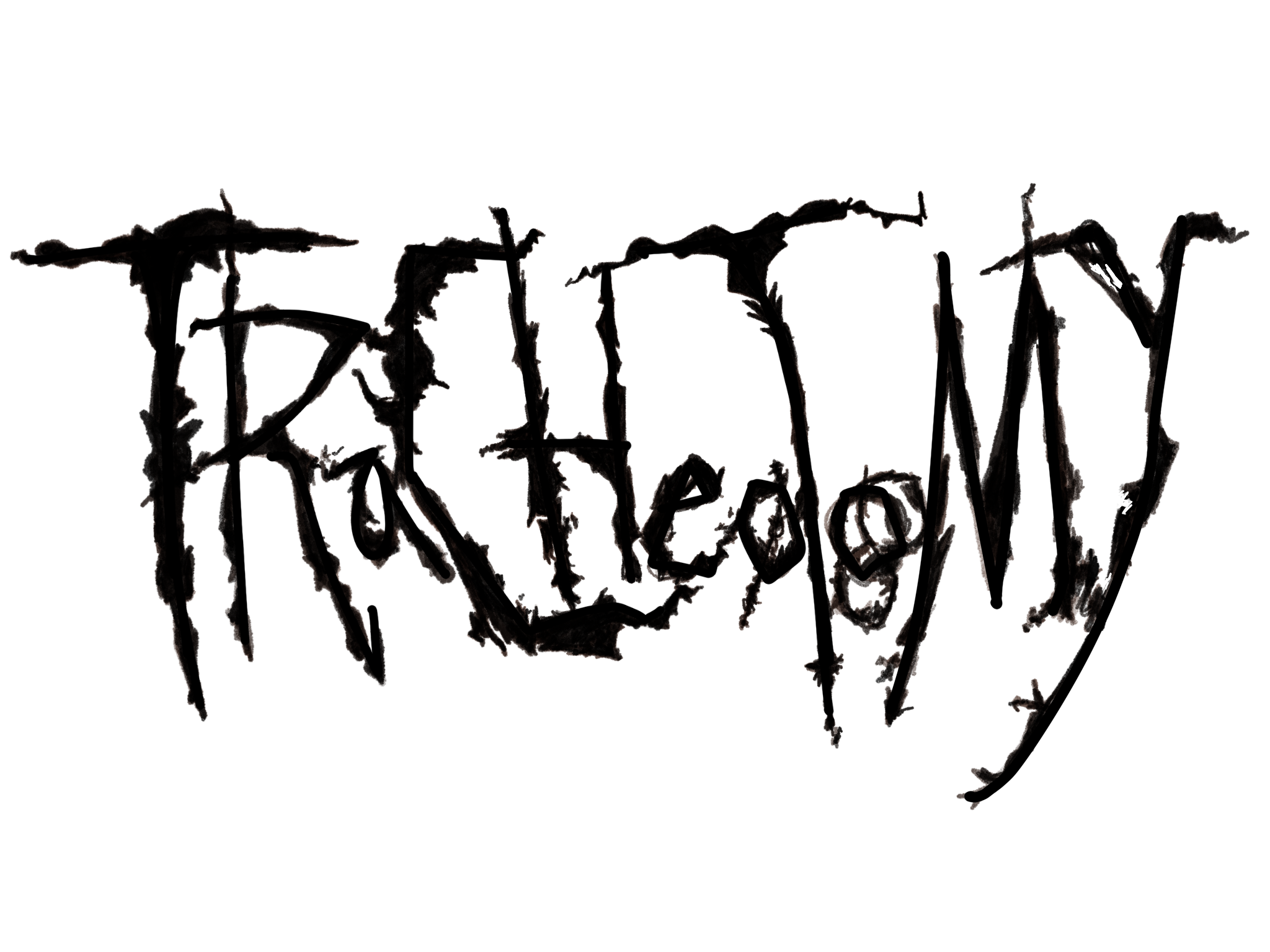
I checked in with Simon and he suggested making the vowels a bit larger and closer together.
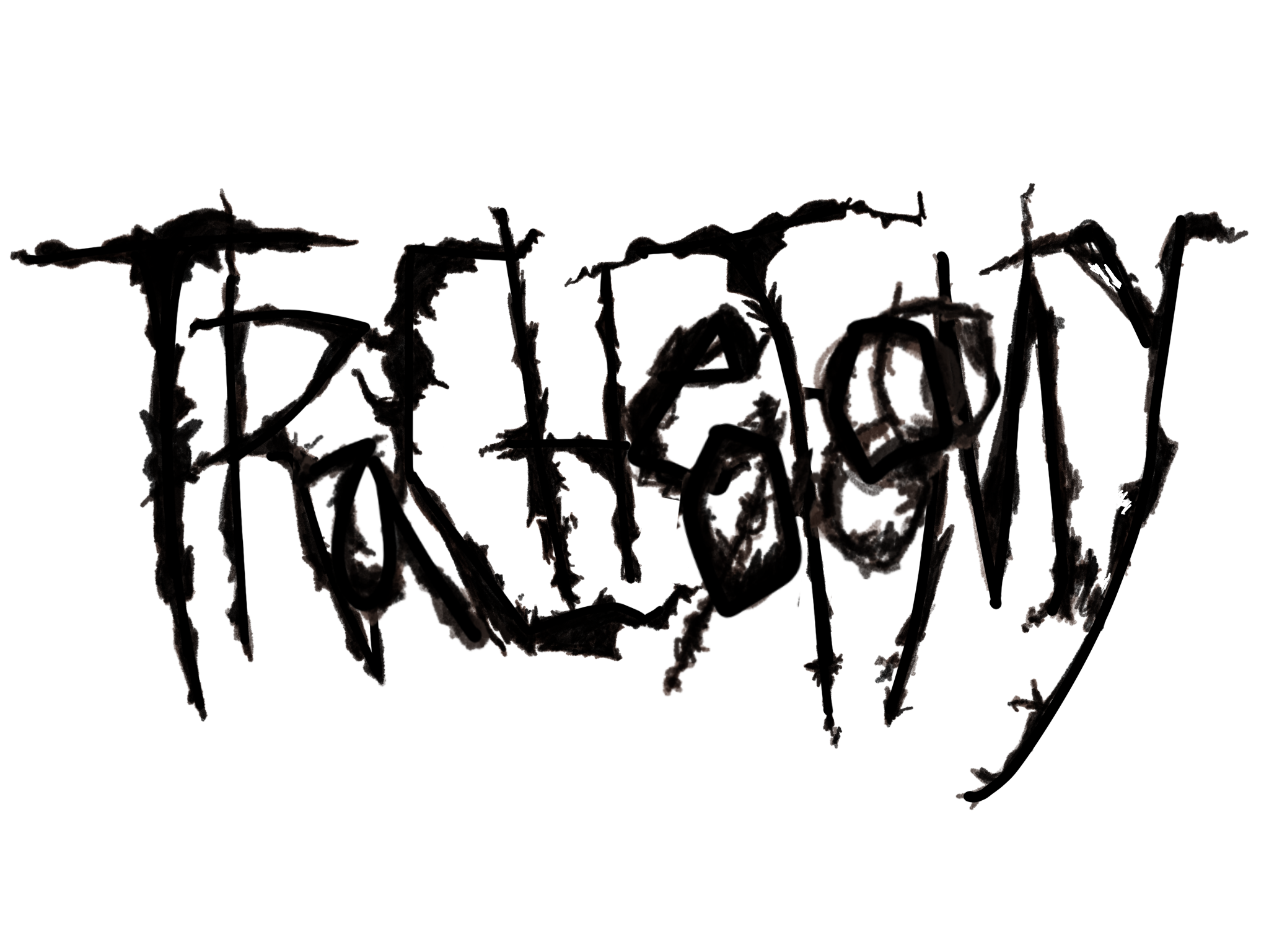
The band members deliberated and ultimately settled on the second design. On its own, the logo can be seen with black lettering against a white background. When placed on cover and band photos, it is usually stylized into white.
Final Thoughts &
Next Steps
Designing for Simon and his band was an absolute pleasure. I expanded my medical knowledge and vocabulary somehow at the same time as my understanding of different alternative music and scenes.
I am currently collaborating with Tracheotomy again for cover art. Stay tuned!