Park Street - B2B Marketplace
Enhancing security and authentication to a subscription based app
My Role: Senior Product Designer on a cross departmental team of Product Owners, Developers, and Accounting
Timeline: 2 week sprint
Tools: Figma, Figma Make, Jira, Google Gemini/Meet/Docs
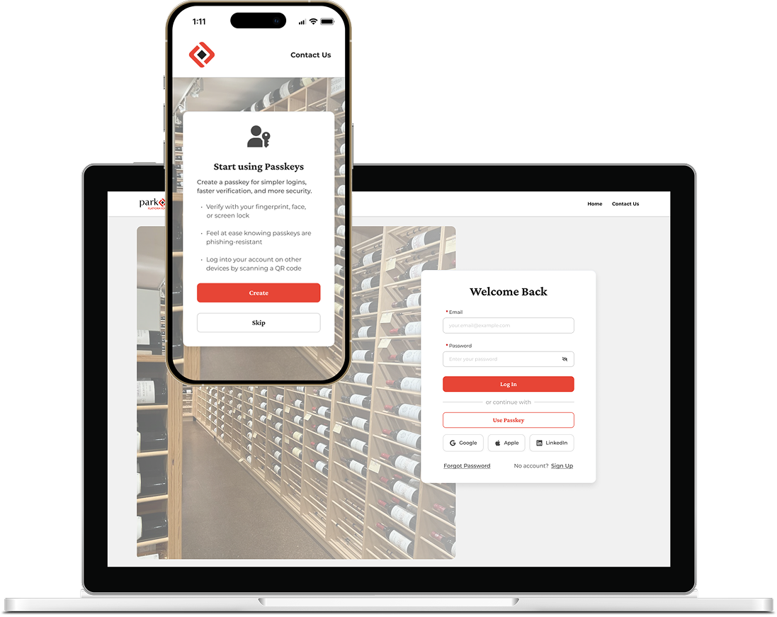
Improving Security without Friction
New security options were introduced in places that felt natural and non-intrusive, such as login, sign up, and settings.
Below is an example of passkey options presented at the mobile app login:
Problem:
A fraudulent money withdrawal was committed due to a flawed system.
My Approach - Consider constraints:
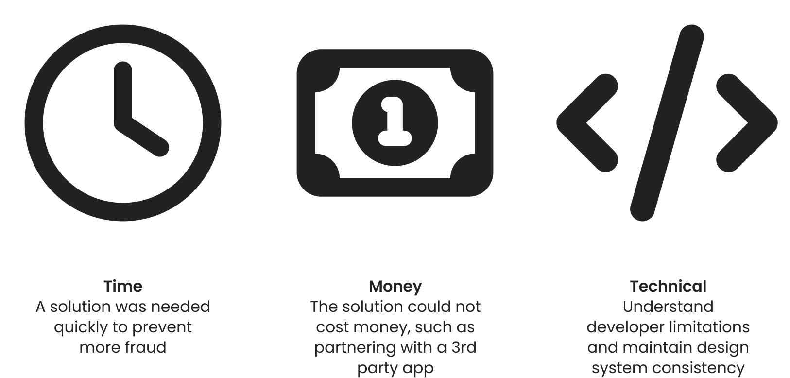
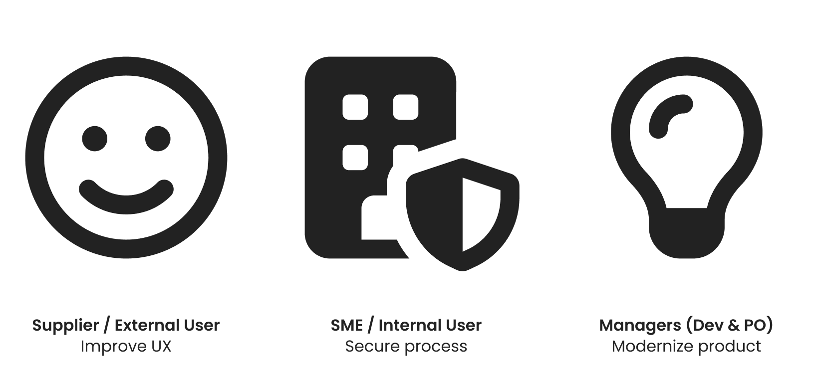
How to solve for all?
Research & Findings:
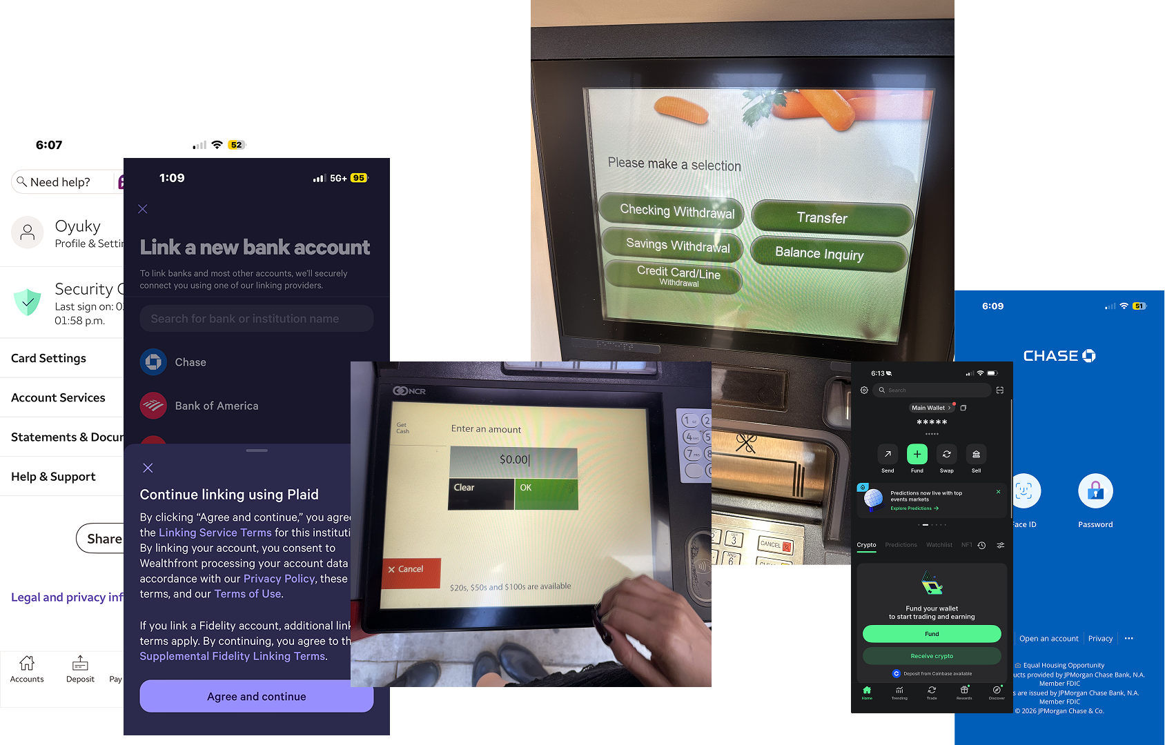
I explored and compared existing bank and money transfer experiences.
I noted the various security measures I came across in each one. Pin numbers, biometrics, and 3rd party authenticators were among some of the options considered but ultimately deemed out of scope due to financial or engineering constraints.
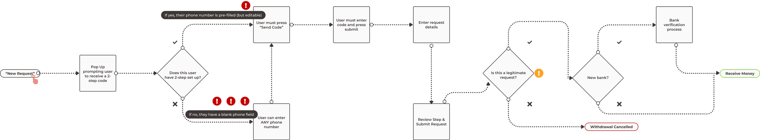
The original, convoluted user flow with security concerns:
When a user would request money, they were prompted to receive a 2-step verification code. However, they could enter any phone number to receive it.
This left accounts open to hacking and fraud (called out in red).
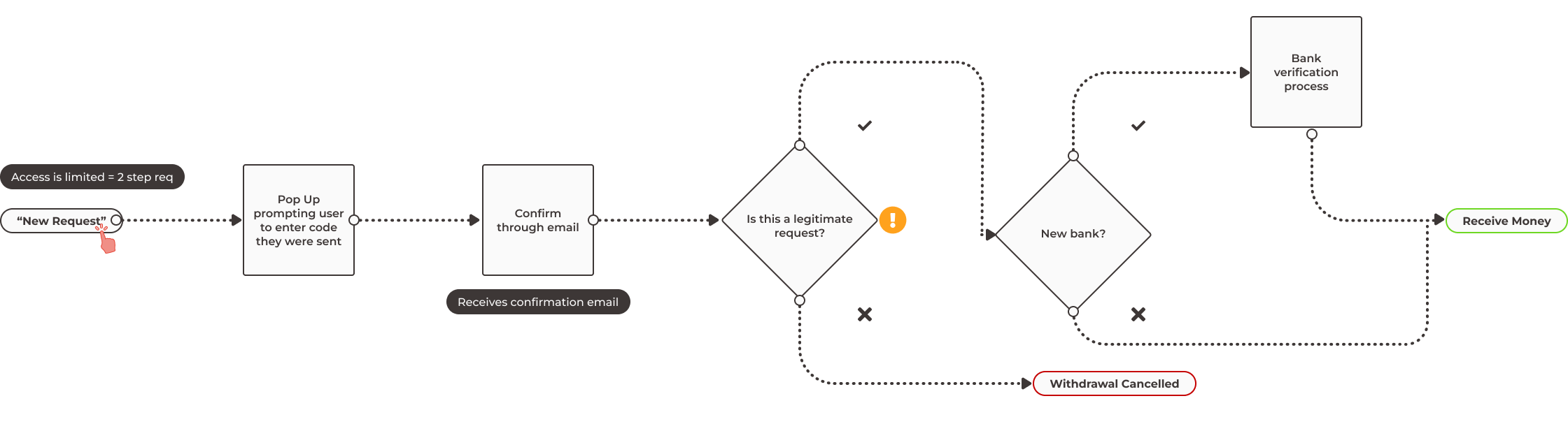
My changes led to a simplified experience with less risks:
By only allowing users that have 2-step verification set up to request money, I increased the security. I also reduced the amount of work a user had to do by sending the code automatically when they initiated the request, instead of having them press a button.
In addition to being a better experience, a code being sent automatically could alert a user that a hacker is attempting to request money on their behalf.
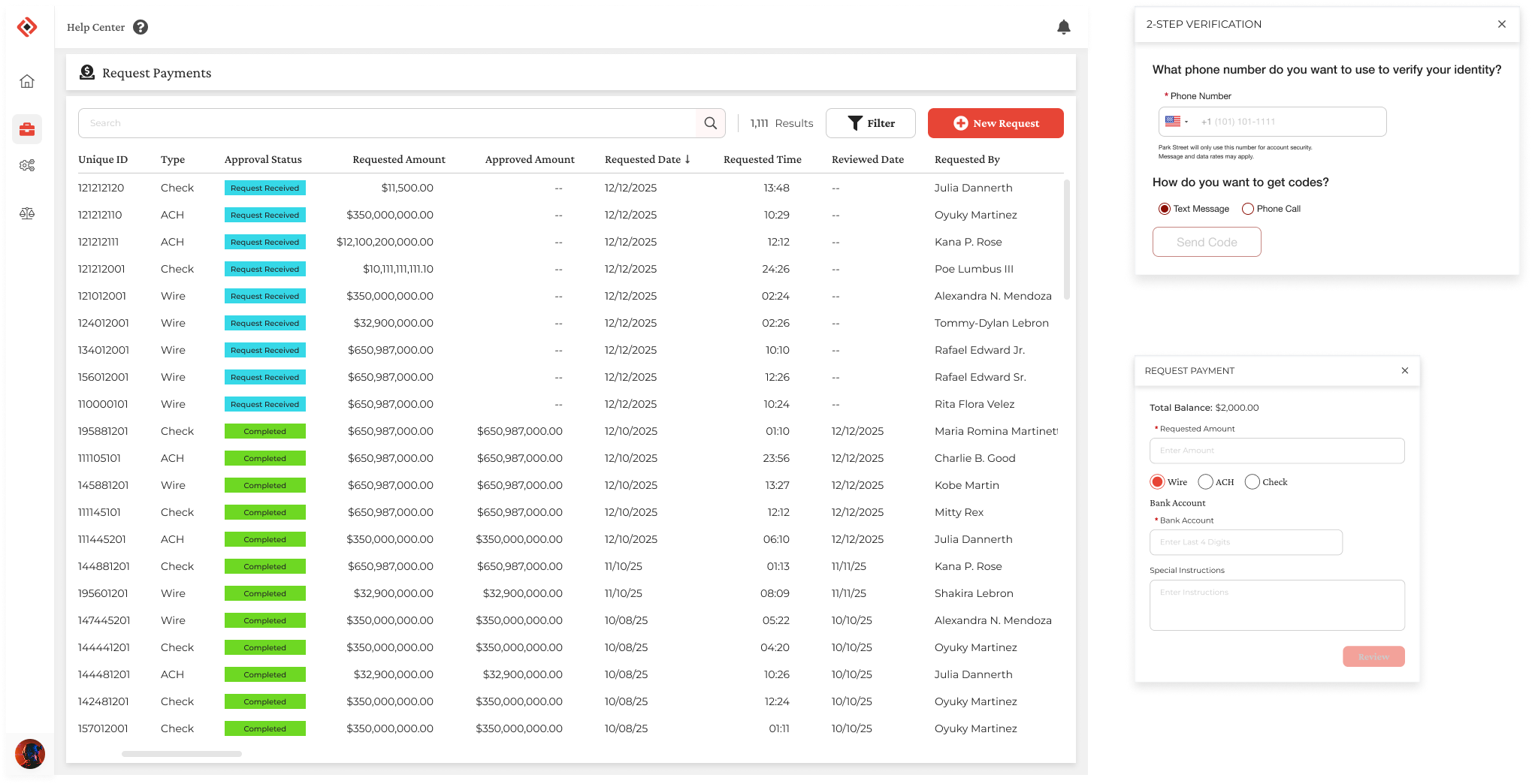
Desktop Screens Before Redesign:
There were accessibility concerns with the original colors. There wasn’t enough contrast and colors harsh on the eyes (absolute white #FFFF and black #0000) were overused.
Moreover, some of the color palette and typography was inconsistent. Overall, the look was outdated and real estate was being wasted on nearly empty headers and navigation.
After Accessibility & UI/UX Improvements:
Softer whites and blacks, plus sufficient contrast were opted in to follow best practices and Web Content Accessibility Guidelines (WCAG) guidelines.
To modernize the product and align it more with the brand vision, edges were rounded and spacing was rethought more efficiently.
The Aftermath

Now that the flow has been determined and the design is complete, it is ready to be picked up by development.
To ensure accuracy, I provide the engineering team with a video walkthrough, notes, and user stories of my updates.