Fashion Nova - Online Clothes Store

User-centered UI updates
My Role: UI/UX Designer
Timeline: 24 Hours
Tools: Adobe XD, Pen & Paper
“I was just on the Fashion Nova site buying a swimsuit, and your version is a lot less busy and has room to breathe.” -Aliza S, 25, Fashion Nova customer and redesign tester
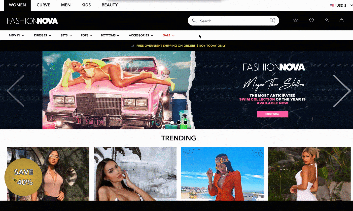
The Current User Experience and Design
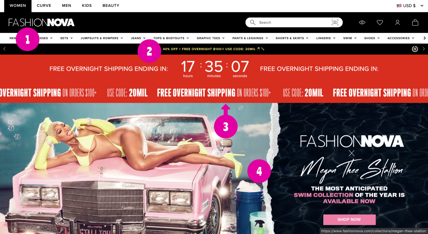
The navigation menu is split into more than 10 different categories. Some of these categories could be grouped together. (For example: “Pants & Leggings” + “Shorts & Skirts” = Bottoms)
A flashing, timed advertisement is placed right above a moving banner.
The banner is advertising the same promotions as item #1.
Overall, items 2 and 3 can be overwhelming on the eyes, especially for someone with sensory issues. Accessibility is taken into account for redesigning this part.
The advertisement is very large, and quite some scrolling is required before the customer is able to browse shopping. Revenues could be increased if users were able to see some of the products they could buy before even clicking into the top menu.
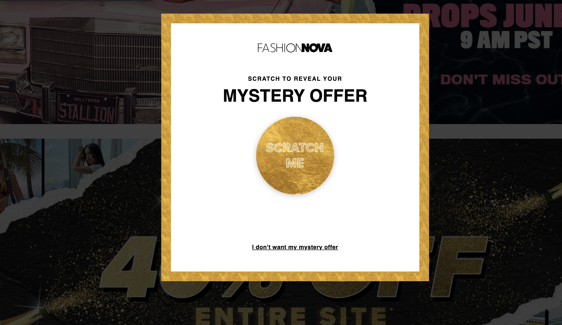
The shopping experience is interrupted every couple of minutes with discount offers, including at the very beginning of loading the site.
The only way to exit out of this promotional pop up is to click a usually psychologically negative phrase such as “I don’t want to save money” and then the user is not able to refer back to the offer at their convenience.
This is what’s known as “confirmshaming” and is a form of Dark Patterns in UX. According to research conducted by Dheeraj Khindri, a Senior UX Analyst at Net Solutions, about 80% of users will leave a site they find untrustworthy or hurtful due to dark patterns.
Therefore, I found it imperative to find another way to inform Fashion Nova customers of existing savings options.
The Process to New Possibilities
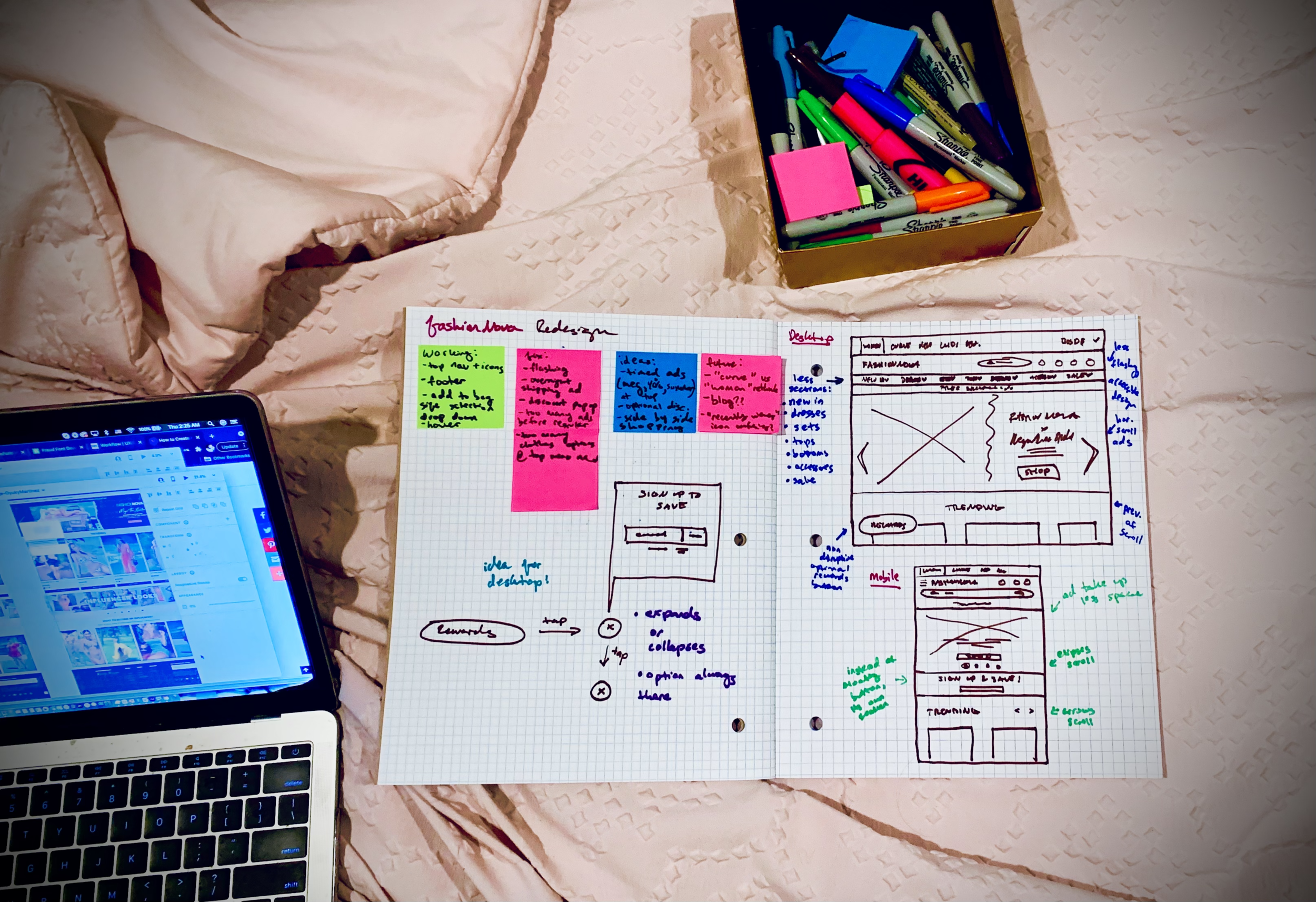
As with all of my UI/UX work, Ideation is an essential piece of the puzzle. After identifying the problems, and writing out what was working and what was not, I began sketching out some possible solutions for both the desktop and mobile versions of the site.
Below is a sneak peek of some of the decisions made in the lower fidelity stages of wire-framing:
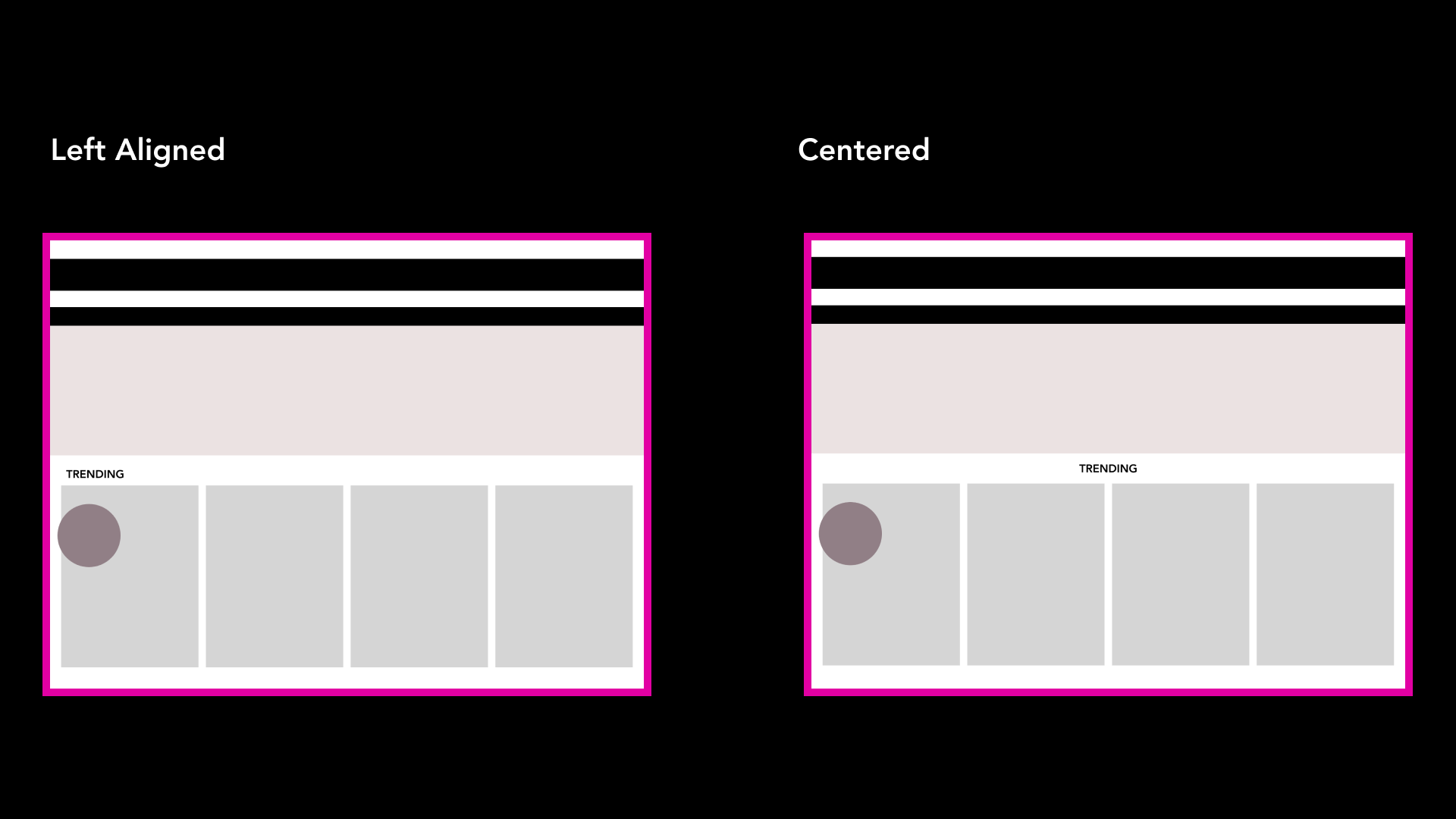
It was decided that a floating, round button would exist at the bottom left of the redesigned Fashion Nova page, so that the user could click in or out of an expanding promotional offer.
Considering Fashion Nova’s exciting and colorful advertisements that would consistently be at the top of the website, the centered title for featured apparel sections wouldn’t compete with the rest of the content as much as the usual left-alignment.
Next Steps & Takeaways
In the future, I’d like to:
• Conduct more user testing and collect feedback in order to improve the prototype and design.
• Explore hover states leading to possible clickable links, such as in the image on the left.
• Fashion Nova has begun a blog, but currently has very limited posts and it has not been promoted. I’d like to help that concept grow by drawing more attention to it on the site through hierarchy.
Accessibility and inclusion are two values that Fashion Nova holds dear as a company, so identifying the ways in which the site’s UX is not reflecting those values is key to a redesign.